If you’ve ever held a printed magazine, a vibrant packaging label, or a precise security document like a banknote, chances are it was made using gravure printing. As someone who’s spent the last 18 years sourcing, refining, and supplying gravure rollers to print houses across North America and Europe, I’ve learned that the secret to that crisp, consistent print doesn’t lie just in the ink or the printing press—it lives in the tiny, patterned cell structure on the roller’s surface. Too many print operators still blame inconsistent color or smudging on ink viscosity or press speed, when the root cause is often a cell that was cut wrong, sized poorly, or degraded over time. Today, I want to break down exactly how cell structure shapes every inch of a final gravure print, and why choosing a roller supplier that prioritizes this tiny detail is non-negotiable for anyone who relies on high-quality output. Gravure Roller
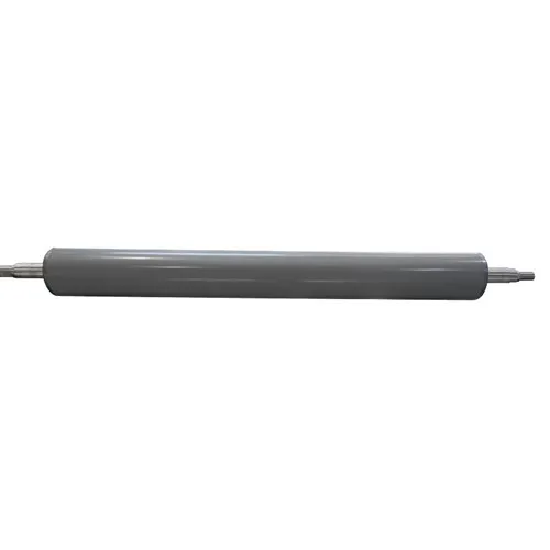
First, let’s get clear on what a gravure cell actually is, because that’s where all the magic (and the mistakes) start. A gravure roller isn’t just a smooth metal cylinder—it’s a finely polished steel core coated in a layer of copper, then etched or engraved with millions of tiny, recessed cells that hold ink. The cell structure describes every part of that pattern: its shape, size, depth, wall thickness, density (number of cells per square inch, or CPI), and even the uniformity of those cells across the roller. Think of it like a cake pan: if your pans have uneven pockets, you’ll get uneven cakes. Same rule applies here.
The most immediate impact of cell structure is ink transfer—this is the bread and butter of gravure printing, since the process works by transferring ink from the roller’s cells onto the substrate (paper, plastic, foil) as it runs through the press. Let’s start with cell size and volume. Larger cells hold more ink, right? That seems obvious, but what many operators don’t realize is that if you’re printing a flat, solid color (like the deep blue of a cereal box background), you need consistent, medium-volume cells to deposit an even layer of ink across the entire area. If half your cells are 10% smaller than the rest, you’ll end up with faint streaks where less ink was deposited. For fine lines or text, though, smaller cells are non-negotiable. A 1-point text line on a pharmaceutical label needs ink just thick enough to be readable, not bulky enough to blur into the background. If your cells for text are too large, the ink will spread beyond the line’s edge, turning crisp instructions into smudges that look unprofessional or even risky for a product with safety warnings.
I learned this lesson early on, 12 years ago, when a major pet food brand came to me complaining that their new line’s ingredient labels kept blurring after 50,000 impressions. They’d been using a roller from a supplier that cut text cells 20% larger than the industry standard for fine print. When we analyzed the used roller, those oversized text cells were holding too much ink, so when the press ran at full speed, the excess ink would “bleed” off the roller’s land (the flat area between cells) and into the adjacent design, turning clear allergy warnings into illegible mush. We re-engraved the roller with text cells matched to their specific press speed and substrate, and their error rate dropped from 18% to less than 1% immediately. That’s when I realized: cell volume isn’t a one-size-fits-all number—it has to be tailored to the exact job.
Next up: cell shape, which is another often-overlooked piece of the puzzle. Gravure cells come in four main shapes: pyramidal, hexagonal, round, and rectangular, each with its own strengths. Pyramidal cells are the oldest style, cut with diamond-tipped engraving tools that create sharp, four-sided recesses. They’re great for solid colors because they hold a consistent volume of ink, but their sharp walls can trap small amounts of air during ink transfer, leading to tiny white spots in the print if not properly cleaned. Hexagonal cells, by contrast, are the most common today because they interlock like honeycombs—their walls are thinner, so you can fit more cells per square inch (higher CPI) without sacrificing ink volume. That makes them ideal for high-detail work, like product photos on luxury cosmetic packaging, where you need thousands of tiny cells to create a smooth gradient from light to dark. Round cells, though, are the best for substrates that have a slight texture, like uncoated kraft paper. The curved sides of round cells let ink transfer more evenly to rough surfaces, whereas sharp, angular cells would leave gaps where the paper’s fibers don’t touch the cell bottom. Rectangular cells are rare, but they’re used for specific jobs like large-format signage, where you need maximum ink volume for bold colors.
I’ve seen what happens when a supplier picks the wrong cell shape. A few years back, a flexible packaging plant switched from uncoated to matte plastic film for their snack bags, and their solid red backgrounds went from vibrant to dull within 100,000 impressions. Their old roller used hexagonal cells, which worked fine for paper, but the matte plastic’s smooth surface didn’t make good contact with the interlocking cell walls, so only 70% of the ink was transferring. When we re-engraved their roller with round cells, the transfer rate jumped to 95%, and their reds were exactly the Pantone shade they’d specified. That’s the thing about cell shape: it’s not just about what works on a sample—it’s about matching it to the substrate you’re running.
Then there’s wall thickness and cell uniformity, two factors that directly impact print consistency across the entire roller and over time. The land area (the metal between cells) has to be thin enough to let the doctor blade (the sharp blade that scrapes excess ink off the roller’s surface) do its job, but thick enough to not wear down quickly. If walls are too thin, the doctor blade will dig into them over thousands of impressions, altering the cell’s depth and volume. One of our long-time customers, a security printing firm that makes banknotes, told me they used a cheap imported roller that wore out in 200,000 impressions, compared to our rollers that last 800,000 to 1 million. When we inspected the imported roller’s walls, they were 15% thinner than the ISO standard for security printing—so after just a few runs, the cells started to collapse, leading to inconsistent ink deposition and counterfeit-prone variations in the banknote’s fine lines.
Uniformity is even more critical. If a roller has cells that vary in depth by even 5% across its surface, you’ll get “banding”—thin, horizontal streaks that run the length of the print. I’ve seen new rollers from suppliers where a full 20% of cells were 10% deeper than the rest, leading to a full run of product labels with faint light streaks that cost a customer $200,000 in wasted materials. For us, that’s why we use high-resolution laser engraving (not traditional chemical etching, which is inconsistent) and test every roller on a surface profiler before it leaves our facility. We measure 10,000+ cells across the roller’s width and circumference to ensure uniformity is within 2%—that’s the standard for consistent print, and it’s non-negotiable for us.
Depth is the final piece of the cell structure puzzle, and it’s especially important for gradients and high-detail work. Shallow cells hold less ink, so they’re used for light areas of a design—like the soft highlight on a model’s cheek in a perfume ad. Deep cells hold more ink, so they’re for dark areas, like the black text in a legal contract. The ratio between shallow and deep cells is what creates smooth transitions between colors and tones. If you cut a dark area cell too shallow, the ink will be too light, and the text will fade; if you cut a light area cell too deep, the ink will be too dark, and the gradient will have harsh, ugly edges.
Last year, a customer who printed high-end art books came to me with a problem: their landscape photos had banding in the sky gradients, making them look like cheap photocopies instead of fine art. Their previous supplier had set all cells to a single depth, not adjusting for tone. We re-engraved their roller with a depth range from 1 micron (for light highlights) to 12 microns (for deep blues), and the gradients became seamless. The customer told me that their repeat orders for the book went up 40% because the photos looked exactly like the artist’s original work. That’s the impact of getting cell depth right.
Now, I know what some of you are thinking: “Gravure rollers are a big investment. Why does the cell structure matter so much, and can’t I just fix bad prints with ink or press settings?” Let’s be real—you can adjust viscosity or pressure to mask small issues, but that comes with trade-offs. If you thin ink to compensate for small cells, it may dry too fast in the press, clogging the roller’s cells. If you increase pressure to force ink out of uneven cells, you’ll wear down your substrate faster, leading to more waste and higher long-term costs. Over time, poor cell structure will also cause your roller to degrade faster, so you’ll be replacing it every few months instead of every 18 to 24 months, adding up to thousands of dollars in extra costs.
As a gravure roller supplier, my job isn’t just to sell you a cylinder—it’s to make sure that cylinder’s cell structure is tailored to your exact job, your press, your substrate, and your quality standards. For 18 years, I’ve worked directly with print operators to audit old rollers, analyze failed runs, and adjust cell specs for new jobs. We don’t use one-size-fits-all engraving patterns, and we never cut corners on uniformity or wall thickness. Every roller we supply gets a full performance report, so you know exactly how many impressions you can expect, what ink viscosity range works best, and how to maintain it to get consistent results.
Ceramic Anilox Roller If you’re dealing with inconsistent color, smudged text, banding, or short roller life, the problem almost always starts with the cell structure of your gravure roller. Don’t waste more money on wasted materials or repeat runs because you settled for a roller that was engraved without paying attention to the tiny details that make a big difference. Reach out to us to discuss your current challenges, share your job specs, and we’ll help you find or build a gravure roller with a cell structure that delivers the crisp, consistent, high-quality prints your business deserves.
References
- Leach, R. H. (2005). Gravure Printing Technology. Pira International.
- Allen, M. (2018). Surface engineering of gravure rollers for enhanced print performance. Journal of Printing Science and Technology, 64(3), 112-125.
- ISO 12647-4:2013, Graphic technology – Process control for the production of half-tone colour separations, proof and production prints – Part 4: Gravure prints. International Organization for Standardization.
- Smith, J. D. (2021). The impact of gravure cell geometry on ink transfer efficiency for flexible packaging substrates. Packaging Technology and Science, 34(7), 319-332.
Kunshan Hanhan Co., Ltd.
We’re well-known as one of the leading gravure roller manufacturers and suppliers in China. We warmly welcome you to buy high quality gravure roller made in China here from our factory. If you have any enquiry about cooperation, please feel free to email us.
Address: No. 1093, B Zone, No. 2 Xugongqiao Rd, Huaqiao Town, Kunshan City, Suzhou, Jiangsu, China
E-mail: info@kshhroller.com
WebSite: https://www.kshh-roller.com/
